SELECTED WORK
Three projects. One way of working.
One case study that goes all the way down, and two more shown as the interfaces they are. Every one of them started from a problem somebody actually has.
THE PROBLEM
Millions of people are offline, and it is not only about cables.
Underserved communities face three barriers at once: connectivity they cannot afford, infrastructure that is not there, and skills nobody taught them. Fix one and the other two still block the door.
High cost of connectivity
Data and devices stay out of reach for many households.
Limited infrastructure
Remote areas may have neither reliable power nor internet.
Limited digital skills
People may have no accessible way to learn and build confidence.
SECONDARY RESEARCH
Four sources, and what each one changed.
25.1% of rural Kenyan households have an internet connection, against 54.1% of urban households.
CA / KNBS 2023-24 Kenya Housing SurveyBuild for far less connectivity than an urban user has, and for it to come and go.
Infrastructure, affordability and socioeconomic factors all shape whether people adopt technology.
CA / KNBS ICT analysisSolve cost, access and usability together. Connectivity alone is not the product.
Gaps in basic and advanced digital skills limit how far digital tools actually get used.
World BankDesign for low confidence: simple flows, guidance in place, plain language.
Mobile and offline learning models already work, including M-Shule in Kenya and an offline resource centre in the North East.
UNESCOLearning has to keep working after the connection goes.
The opportunity was never to hand people internet. It was to turn temporary connectivity into access that lasts.
THE SOLUTION
How SolMoTech works.
Mobile hub
Solar-powered vans visit communities on a scheduled route.
Connectivity
Satellite internet reaches the van, local Wi-Fi reaches the people near it.
Digital platform
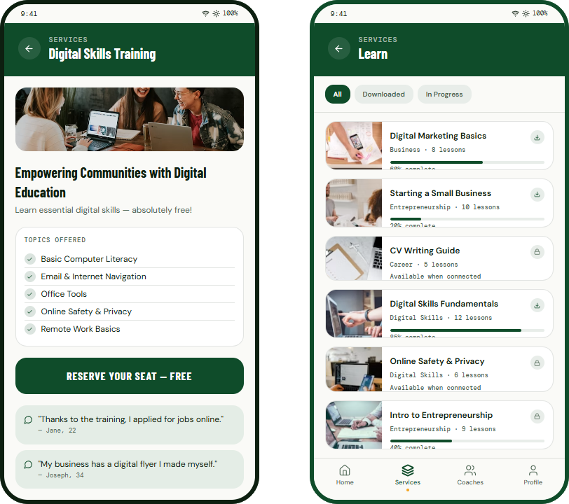
The app carries learning, resources, opportunities and coaches.
Opportunity
Skills, education, work and coaching, built on top of the visit.
WHAT I CHANGED
My first version solved the wrong half of the problem.
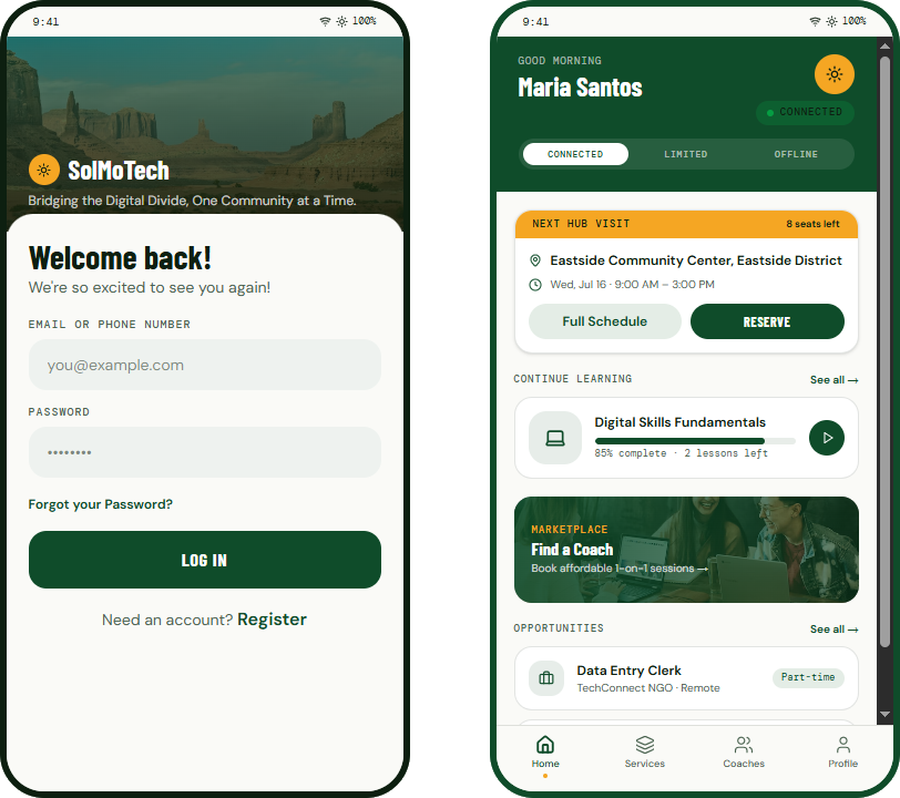
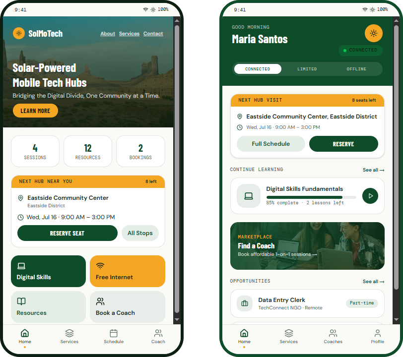
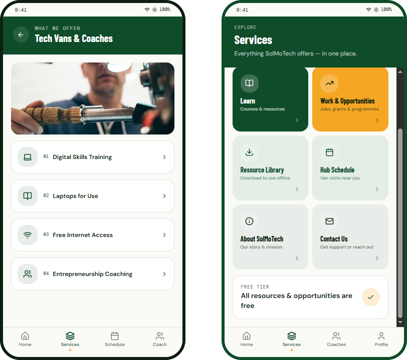
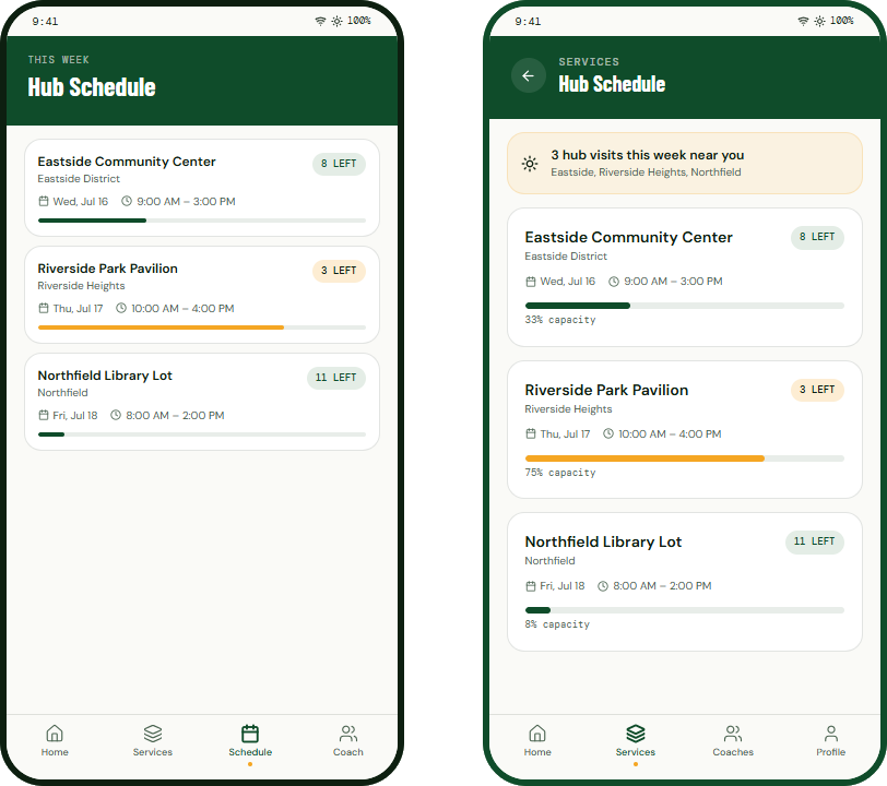
Three versions across two years. V1 was about getting people online. It worked, and it missed the point. The van leaves. So V2 is built around the part I had ignored: what a person still has after the connection is gone.
The challenge wasn't simply providing internet access. It was designing an experience that remains valuable when connectivity is temporary.
LINDA GITAU, SOLMOTECH CASE STUDY
Before either version, it was a greyscale wireframe called Solar Hub.
Built as a course milestone. No colour, no design system, no brand, just the flow. Everything below is what happened to it over the next two years. The original is still live, and you can click through the whole thing.
THE PROTOTYPE
Watch someone actually use it.
Two minutes, unedited, the V2 prototype from home screen to booking a coach.
SOLMOTECH V2 PROTOTYPE · SCREEN RECORDING · NO SOUND
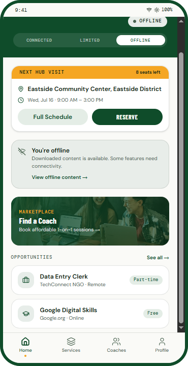
THE V2 SCREENS
Eight screens from the shipped prototype.
HONEST STATUS
What I still do not know.
SolMoTech is a self-initiated concept. The research is real and cited, the hypotheses are not yet validated, and I would rather say that than imply otherwise.
Discoverability
Can a first-time user find when and where the next hub visit happens?
Offline learning
Can someone download content, disconnect, and pick up where they left off?
Navigation
Can people finish key tasks with nobody sitting beside them?
Coaching
Do people understand the value, and feel confident enough to book?
Service model
Would people come back, and treat it as worth relying on?
CONCEPT → PROTOTYPE → READY FOR USER VALIDATION
PROJECT 02 · WANDERLUST
A booking flow that does not lose you halfway.
Travel apps tend to be beautiful until the moment you try to pay. I designed WanderLust as one unbroken run: browse a place, pick a flight, check the summary, pay, and land on a confirmation you can actually read. A concierge sits alongside it for the questions a booking form cannot answer.
I did not research this problem. I work in it. My day job is administrative assistant at a tour company, managing client bookings, itineraries and travel documents for local and international trips. Every friction point this flow is built around is one I have hit in real work: the changed flight, the booking that will not confirm, the client who cannot find their itinerary an hour before the airport.
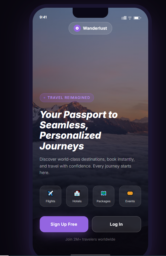
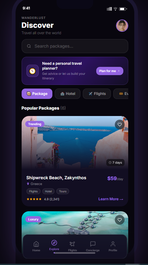
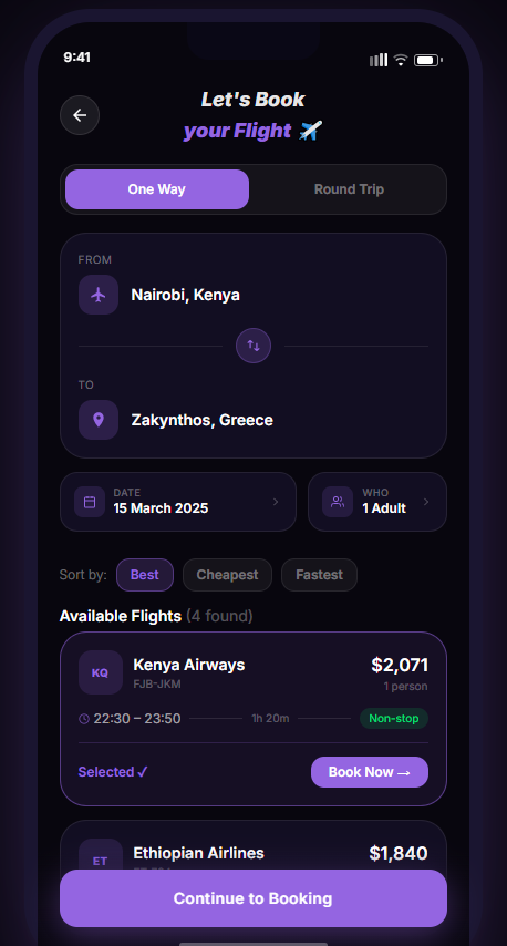
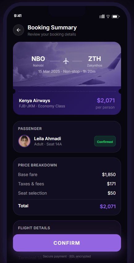
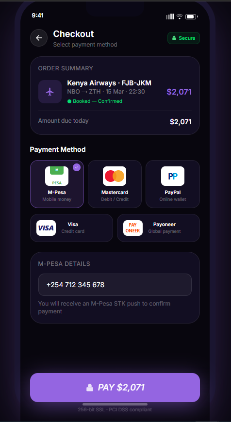
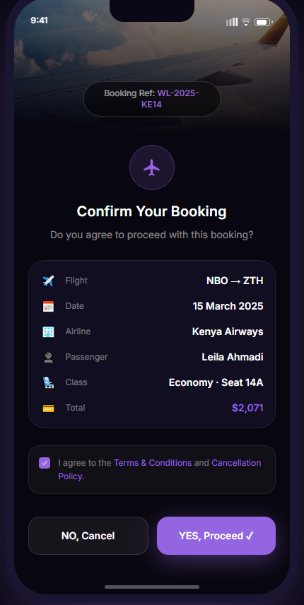
Dark by default, and legible with it
Travel happens in airports at night. The whole system is built on a deep violet ground with one bright accent, so a boarding gate at 5am is still readable.
The concierge is the differentiator
Booking engines answer what is available. A person answers what you should do. WanderLust puts that one tap from the itinerary.
Trips, not transactions
The profile counts journeys rather than orders, so the app remembers what you did instead of what you spent.
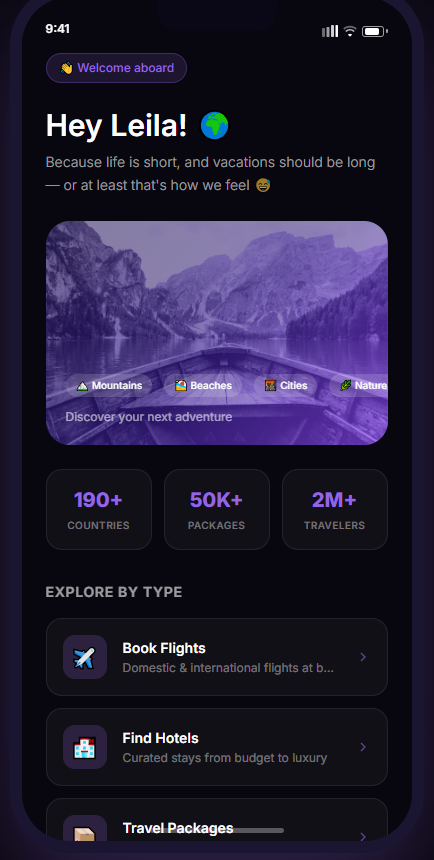
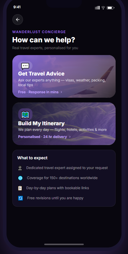
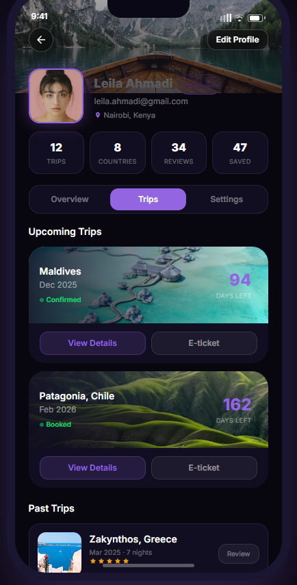
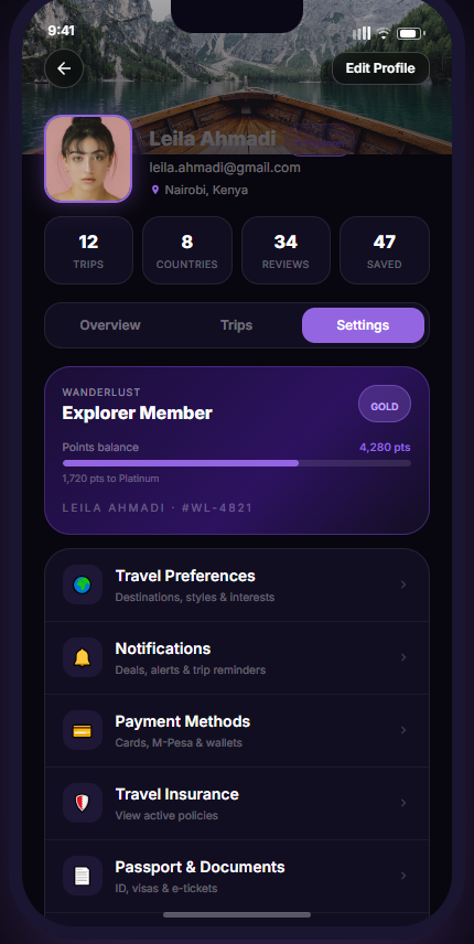
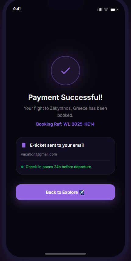
SCOPE · UI DESIGN AND CLICKABLE PROTOTYPE. THE WRITTEN CASE STUDY IS STILL IN PROGRESS, AND I WOULD RATHER SAY SO THAN PAD IT OUT.
PROJECT 03 · UZIMA WATER
A meter reading is a number. This had to be an answer.
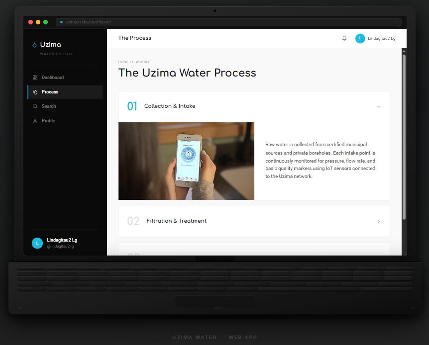
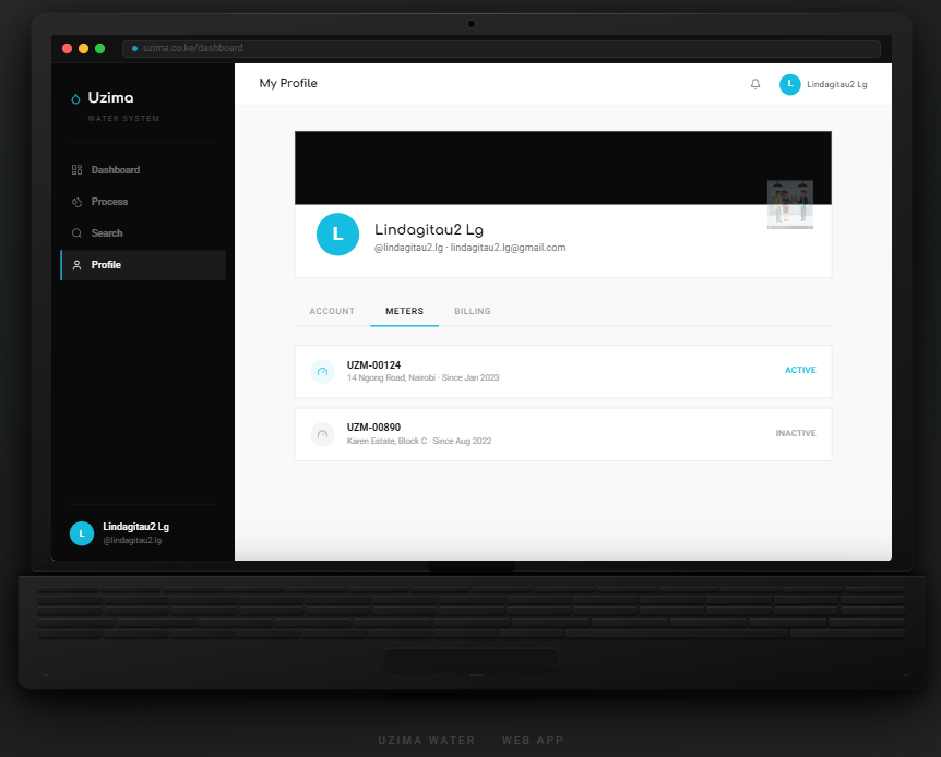
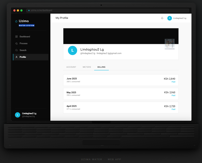
A smart water meter produces data all day and tells a household nothing. Uzima turns that stream into the four things a person actually wants to know: how much today, is anything running right now, is the meter healthy, and what will the bill be.
Where this comes from, stated plainly. Uzima is my bachelor thesis project for my BBIT degree. Self-initiated, and still in progress. The technical half is a smart water metering system with a SQL database behind it, researched against water access in Kajiado County. What you are looking at below is the design half: the interface I built on top of that work. It is a design, not a deployed product, and I would rather tell you that than let it look like more than it is.
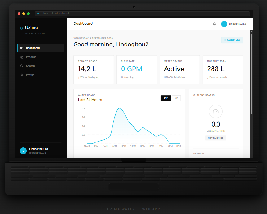
Four numbers before anything else
Usage today, flow rate now, meter status, monthly total. Everything else on the page is available underneath, and nothing competes with those four.
A curve beats a table
The 24 hour usage graph makes a leak visible as a shape. You do not have to read numbers to notice that something ran all night.
Light interface, on purpose
This one runs bright while WanderLust runs dark. A utility dashboard gets read in daylight, on a laptop, by someone in a hurry.
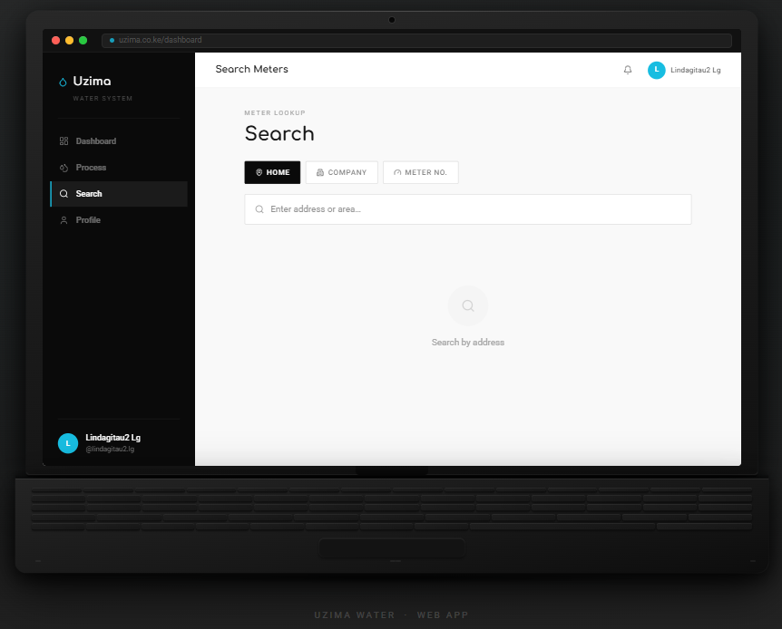
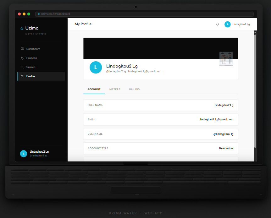
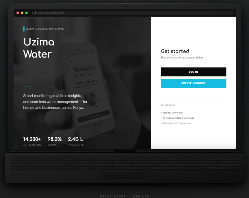
SCOPE · BACHELOR THESIS PROJECT, SELF-INITIATED AND STILL IN PROGRESS · SQL-BACKED ON THE TECHNICAL SIDE · THE INTERFACE SHOWN HERE IS DESIGN WORK, NOT A SHIPPED PRODUCT.
TRY IT
Press and hold.
This is the whole job in one gesture. Scattered pieces, held steady, until they become something a person can use.
INSIGHT BECOMES INTERFACE.
CONTACT
Seen enough?
Open to opportunities, collaborations and interesting problems. Tell me what you are working on.